The evolution of the feature floor |
29.08.14 |
PLUSH carpets, polished concrete, timber floors; where we tread says a lot about who and how we live in our homes. Not only do floors need to be functional – they are the most used surface in our homes – but they also need to be beautiful. Whatever floor covering you use, the most important thing to remember is that most are a permanent fixture! So choose wisely. As with every feature in your home, your flooring choices need to be aesthetically pleasing and tie in with the rest of your interior design choices.
Timber floors
Timber floors are probably the most popular choice of covering. They can be polished, stained, painted, lime washed – the choices are many. An added bonus with timber floors is the hygiene factor. Unlike porous surfaces, timber floors are easy to clean and easy to maintain. Floorboards are a favourite with families with young children.
DO ensure the floorboards have been sealed.
DON’T pull original boards out when renovating – often all they need is a buff and polish to restore them to their natural beauty.
REMEMBER you can always cover them with rugs in winter or to create a cosy room feel.
Polished Concrete
If you want to create that WOW factor, polished concrete floors certainly achieve that! But, concrete floors do not suit all types of houses – they look great in warehouse style home, not so much in terraces. Concrete floors also suit families.
DO use colour. They can be oxidised, polished, speckled. Use your imagination!
DON’T forget underfloor heating!
REMEMBER concrete floors are very expensive so have a long think before deciding on this surface.
Carpet and rugs
Nearly every home has some kind of plush floor covering; whether it’s wall-to-wall carpeting, room rugs or hall runners. They are a softening feature in a room and the designs, colour and texture options are virtually endless. You can create so many different looks and also quickly change the look of a room by either swapping a rug or taking it away in warmer weather. Hall runners can be very effective and make a bold statement. Sisals are a good choice.
DO get creative. Experiment with textures such as sea grass, use borders, try a Moroccan rug! Have fun and get as personal as you like. Linen edges add a touch of class or why not have a go at creating your own design.
DON’T forget to regularly vacuum and shampoo rugs and carpets. Not a popular choice for asthmatics and those with allergies.
REMEMBER carpets don’t need to be expensive. Keep the flooring in theme with your home.
The evolution of the feature wall |
21.08.14 |
THERE’s more to slapping a coat of paint onto a wall that makes it into a feature.
Like many interior design trends, the feature wall has evolved and embraced colour fashions, textures, patterns and materials.
I have seen the feature wall transition from just selecting a different colour to stand out from the rest of the interior palette, to the integral puzzle piece completing the internal styling of a home. It appears feature walls have come full circle.
A splash of COLOUR
In the 1990s, it was very popular to have one wall in a room painted in a bright, bold colour. Fuchsia, fire-engine red and bright yellow were used, with much aplomb. However as trends change these bright colours have been toned down to a more elegant, understated look that is easier and more pleasant to look at.
DO use a darker shade or even a few extra coats of the same colour used on the other walls. Think neutral, soft shades.
DON’T use bright red, no matter how much you love the colour. Invariably it’ll look like blood!
REMEMBER have fun with a feature wall. Experiment but keep in mind it must fit into the style, colours, furniture etc. of your home. The beauty is that if you don’t like what you’ve created, a lick of paint can change the look quickly and inexpensively.
Paper and other coverings
Wallpaper has made a comeback – and in a big way! These days you can get virtually any pattern, texture or colour you like, and you can even create you own design! Don’t be afraid of stripes, dots and unusual shapes.
DO use wallpaper in unconventional places such as a powder room. A little can go a long way in making a statement.
DON’T rush the job. Wallpaper is expensive and tricky to use. Be very careful in planning and hire a professional. Wallpapering is not a DIY job.
REMEMBER it’s on for the long haul. Carefully assess the room, space and interior design before embarking on the wallpaper revamp.
Walls as art
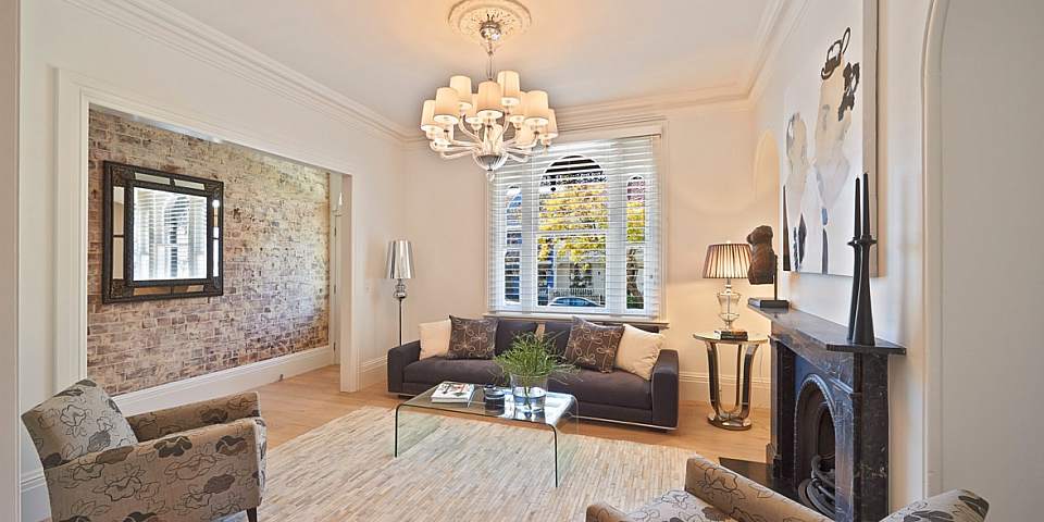
An exciting trend emerging is the use of other materials on walls such as copper panels. Using textured, high gloss, metallic materials create a luxurious and eye-catching feature wall. Every home needs some art on the walls; why not transform a wall, or walls into a piece of art? Other materials making a statement include limewashed internal brick, murals and other three dimensional panels.
DO make a bold statement. Big and bright is key. Not for the fainthearted. Have fun!
DON’T get carried away. One wall or even part of a wall is enough to really stand out.
REMEMBER to ensure the textures and materials enhance your home, reflect light and fit in to the theme of your home. It’s all about balance!
Penny Hanan |
12.08.14 |
There’s that one room in your house that completely puts you in the right frame of mind, the right mood. It could be the lighting, the furniture or just a feeling. It is a place to escape, relax and feel completely at ease.
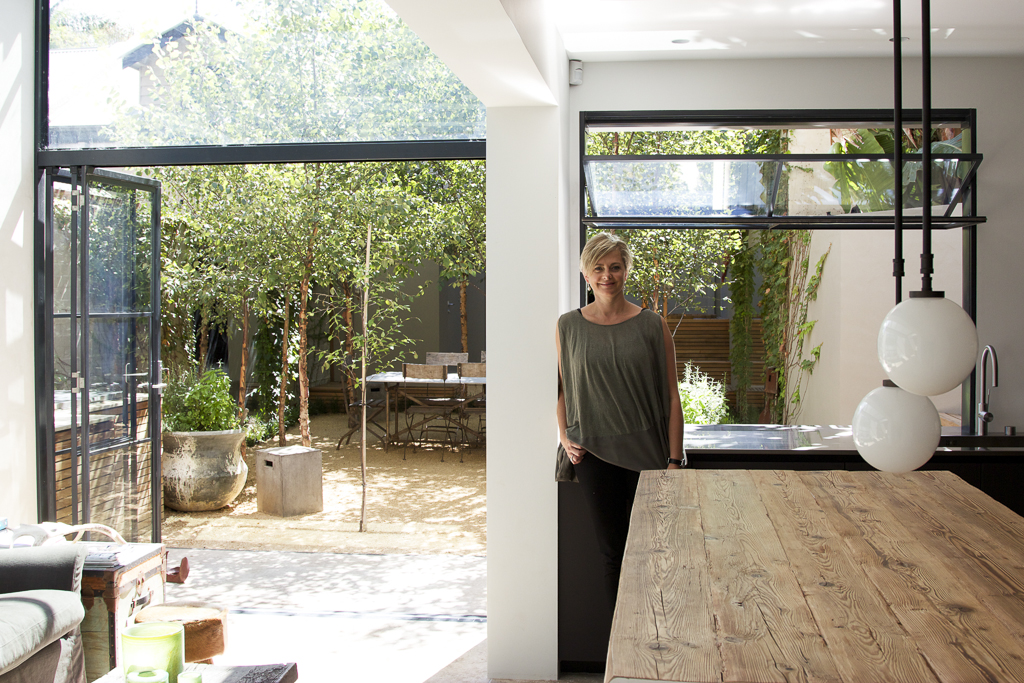
Penny Hanan lives in her dream home in Paddington with her husband and two daughters. After extensive renovations, Penny has finally created her family home, one which will evolve with her family. She runs the unique artisan deer design business, 1803, which processes the by-products of her family’s deer farm in Orange to create beautiful pieces
What is your favourite room in your house?
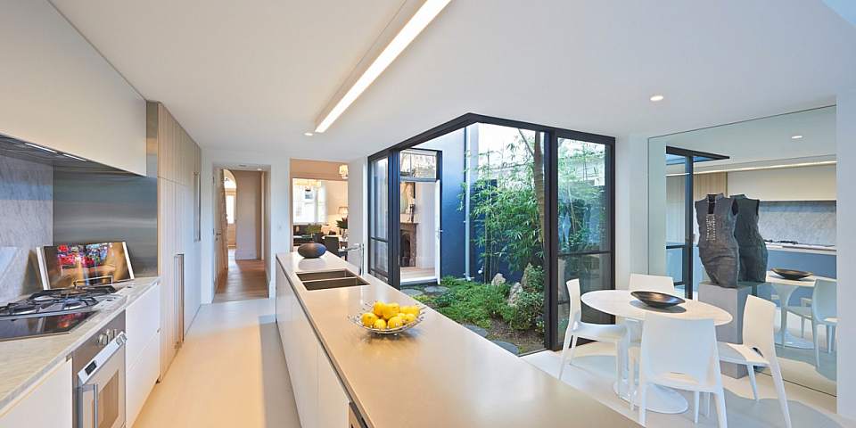
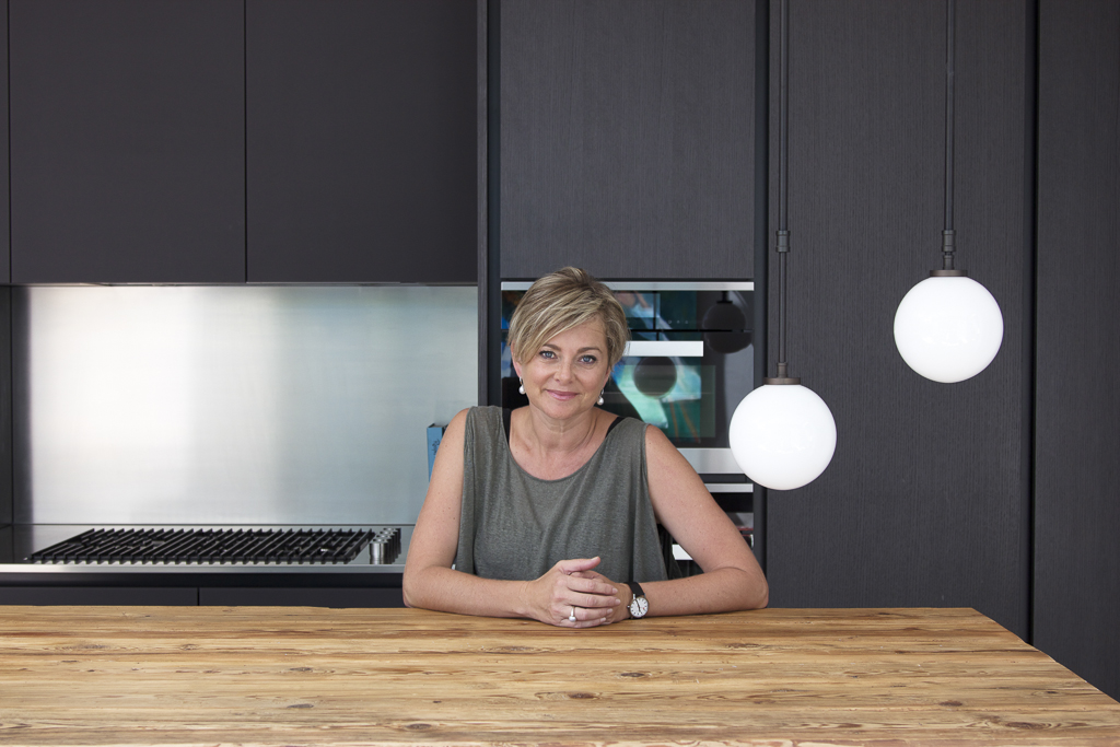
My favourite room is the kitchen/conservatory. It is on the ground floor of our house and rear facing. It is flooded with natural light and is mostly made of steel and glass. It is a wonderful place to live. As the kitchen is north facing, there’s natural light all year around. It’s large enough for the whole family space. It features a large wooden bench where everyone can congregate around. There’s also a little computer nook and an open, relaxed sofa area.
Why is it your favourite space?
As a family, we wanted to create a generous, light and uncluttered kitchen made with natural materials – stone glass, steel and wood. All the textures are very calming as are the colours of space. We used a neutral palette to compliment the natural materials. As a mother, I wanted to create a space to nurture my family. I also love entertaining and wanted a welcoming kitchen where I could have all my friends over. The kitchen itself is a beautiful Boffi designed seamless kitchen. It really was my one extravagance.
How does your favourite room represent who you are?
I think the space represents me in that it is generous, open and full of light – exactly the way I try to live my life. I also love to entertain. I feel I have created this home for the future for our family. It’s a great way to wake up ever day!
What do you like most about your kitchen?
It is a seamless space! And I just love the textured light. It makes me feel so happy, so lucky, so humbled. I really can’t believe I live in such a nice house everyday.
If you could invite anyone into your room, who would it be?
Jamie Oliver. I’d love to get down and dirty in my kitchen, open a bottle of wine and get cooking. I love his confidence and his generous approach to cooking and feeding people whether it is his family or a school. It’s the generosity of spirit and his enthusiasm for embracing the simple things in life.
What would you change about your kitchen?
Nothing!
What advice would you give on how to create the perfect space?
You need to find an amazing builder, one who will truly listen and use top-notch tradespeople. Always engage professionals, open your mind to options, research and explain exactly what you want to achieve!


 SELLING homes is not just a career; it is an art form – one that is carefully honed over years of life experience and knowledge. And, I can proudly say, that I still absolutely love what I do – day in, day out.