Bed Linen Trends
There’s nothing better than flopping down on your bed after a long day to unwind. Feeling the soft mattress, fluffing up your favourite cushion, and surrounding yourself with the serenity.
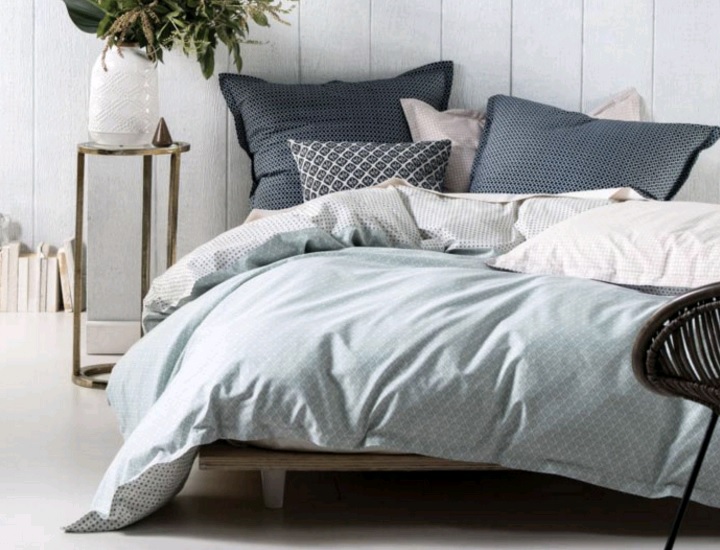
Photo Source
Creating the perfect ambience in your bedroom isn’t rocket science – it’s all about personal taste. However, just like every other room in your house, your bedroom should be constantly evolving to reflect not only your life but popular trends that emerge. Sometimes a whole-room overhaul may be needed – especially if you haven’t updated your room in a while – but other times it can be as simple as buying new linen or adding new soft furnishings. In this blog, I’ll be discussing bedroom colour trends for 2016.
And the colour of the year award goes to…
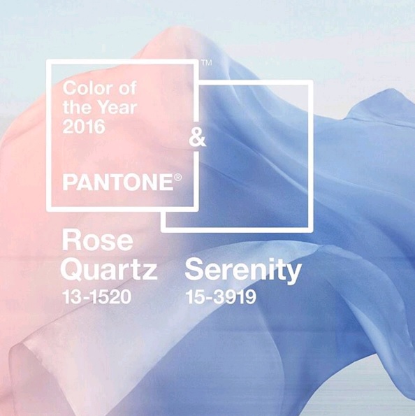 Photo Source
This year’s Pantone Colour of the Year is – for the first time – a blend of two shades; Rose Quartz and Serenity. These two softer shades, the Executive Director of the Pantone Colour Institute Leatrice Eiseman, said “demonstrate an inherent balance between warmer embracing rose tone and the cooler tranquil blue, reflecting connection and wellness as a soothing sense of order and peace.”
I don’t know about you, but that description sounds like the perfect atmosphere for a bedroom. By following this colour scheme for your bed linen, throw rugs, pillows, cushions and other furnishings, you can create a harmonious atmosphere.
Now, just because the colour(s) of the year are these soft blue/pink shades, doesn’t mean you need to convert your room in to a nursery. The last thing you want to create is a room that is more suited to a baby! Soft pastels are popular in children’s rooms as they do create a tranquil environment. So, how do you utilise these colours and still maintain a sophisticated, adult bedroom?
Less is best
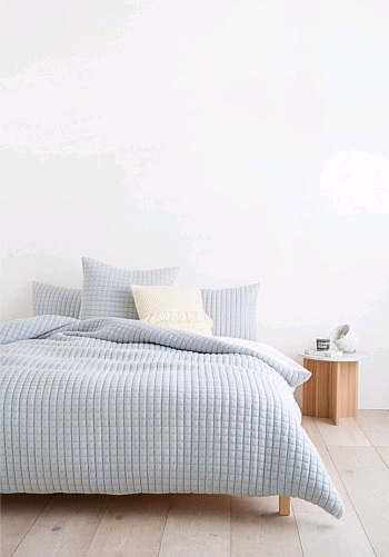 Photo Source
“Rose Quartz is a persuasive yet gentle tone that conveys compassion and a sense of composure. Serenity is weightless and airy, like the expanse of the blue sky above us, bringing feelings of respite and relaxation even in turbulent times.”
So we’ve established these tones are perfect for a bedroom, but don’t feel inclined to change EVERYTHING in your room. As these two shades work perfectly with neutrals, work with what you’ve already got. For example, if your bed linen is mostly beige/white/cream, then add a throw rug in Rose Quartz and maybe a few throw cushions in Serenity. If you have heavy curtains on your windows, maybe think about adding a lightweight layer in one of the Pantone shades. This will add a whimsical element, yet not too dramatic. A few subtle changes can make a huge difference.
Add some sparkle and texture
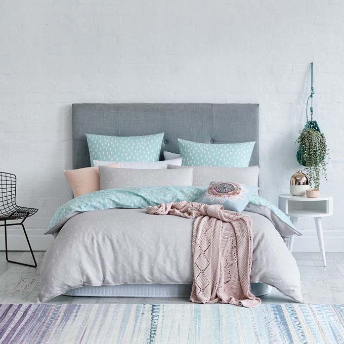
Photo Source
Following on the same colour scheme, another design trend that is making an appearance is rose gold. Metallics have been gaining popularity in bedrooms, living areas, kitchens and bathrooms. Adding a little bling in the form of a rose gold lamp, mirror, photo frame or even hat stand can accentuate the tones of the soft furnishings in your bedroom. Don’t go overboard, one or two shiny pieces will be enough.
Texture can add another dimension to a soft palette. Velvet is luxurious and provides an air of extravagance. Why not experiment with having one piece in your bedroom – an arm chair or cushion – covered in Rose Quartz velvet?
Have fun and play around with this year’s colours. As always, make it your own to enjoy and ensure you create a space for calm and relaxation.
 |